Summary of the Chapters
Screen Based Thinking
- Highlights how we have become acculturated to ‘there’s an app for that’ even when the app is more hassle or work than the original process
Slap an Interface on It!
- Lots of examples of where a screen based interface has made things worse or more complicated e.g. ordering food in a restaurant
UX ≠ UI
- Believes that UX has become confused with UI and that this is a big reason why the design of apps and screen interfaces can be so poor for the user
Addiction UX
- Critique of the fact that most of the biggest software companies are using ad revenue to generate their profit and this distorts how they design their interfaces => addiction is better for them as we stay on their sites for longer => more profit
Distraction
- Phones are made to distract us and this distraction can have real world consequences e.g. car crashes
Screen Insomnia
- The light from screens is probably bad for our health. Talks about rates of prostate and breast cancer (association not necessarily causal)
The Screenless Office
-“The best design reduces work. The best computer is unseen. The best interaction is natural. The best interface is no interface.” (pg. 80)
Back Pocket Apps
- Pareidolia = an error in perception i.e. phantom vibrations
- Very interesting idea about a few examples of apps where they are encouraging users to keep their phones in their pockets. Also talks about the boring approach the many companies have used to ‘slap an interface on it’ including fast food, supermarkets without necessarily considering the trade offs.
Lazy Rectangles
- Interesting critique of the flattening potential of the wire frame design approach. Writes about how the early design process can be expansive but they are then reduced to buttons on a screen
Computer Tantrums
- Writes about passwords and user names and how these systems are about what suits the software rather than the users.
Machine Input
- Very interesting idea about depersonalising computers – pushing their functions into the background – so that they become less obtrusive or obstructive. References an article by Mark Weiser (1991 Scientific American) which is an interesting read, especially as some of their ideas have been created (i.e. the pad sized computer).
Analog and Digital Chores
- The idea of digital chores and that many apps increase the burden of work that we have
- We should be aiming for new things that reduce our workload, not increase them. Uses the example of a washing machine with 12 settings – should the machine be able to work out the correct setting for us?
Computing for One
- Talks about the way that most design is for the average rather than specific and that this is where machine learning should be used.
Privacy
- Data privacy and the way that we tell people what data is being stored is very important and needs to be clearer.
Automatic
- Suggests the automatic solutions are hard to deliver because of it is hard to be sure of people’s intentions (when you are trying to automate a function) but when it works they can be very very successful.
Failure
- Solutions should also consider situations where the technology might fail and ideally have a back up solution
Exceptions
- Emphasises the point that ‘the best interface is no interface’ is an ideal to work towards and that in many situations we need screens and interfaces
- Technology should not be there to “get us addicted” (pg. 209) and should make our lives better “quietly and elegantly”.
Reflections
The book has a lovely black and white aesthetic and the author is obviously expert in UX as although the images are simple (using icons and simple shapes) they very effectively support the message of the book – elegant, purposeful simplicity.
I think the book is a useful critique of the idea of the screen interface as immutable and that screen based interfaces are prevalent because they work the best. It is a call to arms about the importance of considering good design principals e.g. form that supports and does not get in the way of the function and will make me think more carefully about the importance of good UX and UI and how they are not the same thing!
My critique of this kind of design philosophy is that by becoming invisible and creating no friction for the user, it can obscure the human processes that create the technology and this illusion (in my opinion) is part of the way that tech has been able to alienate us from each other and our communities. It feels easy to be social on a message board but real life socialising is messy and can be complex. Tech sometimes makes things too easy!
I think perhaps the point here is that if the aim of the UX design is to create this kind of friction, it would be better if it was intentional rather than due to clunky design.
Reference
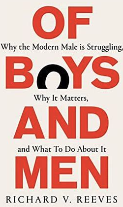
Krishna, G. (2015). The Best Interface is No Interface. Erscheinungsort Nicht Ermittelbar: Pearson Education (Us.